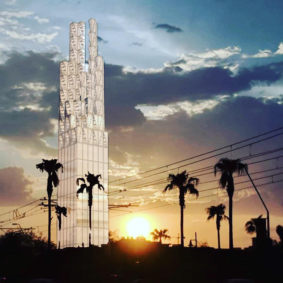
Rereading M.M. Bakhtin this week. This post was written in one sitting (broad brush) and is an intentionally incomplete (unfinished work in progress) essay. I will write something with a little closer reading soon, as I am waiting for more books that are on the way. What I have found interesting about Bakhtin’s writing, since I first read his work, is the same point of interest I have with respect to Immanuel Kant. That is, their philosophies often appeal to architectonics.
Bakhtin and Kant undoubtedly held quite different conceptions of architectonics. Should we associate Bakhtin’s sense of architectonics with the avantgarde of his time and place? I know these three modes I am about to mention are so vastly and fascinatingly different, but was anything other than a classical, rococo, or gothic conception of architectonics possible in Kant’s time and place?
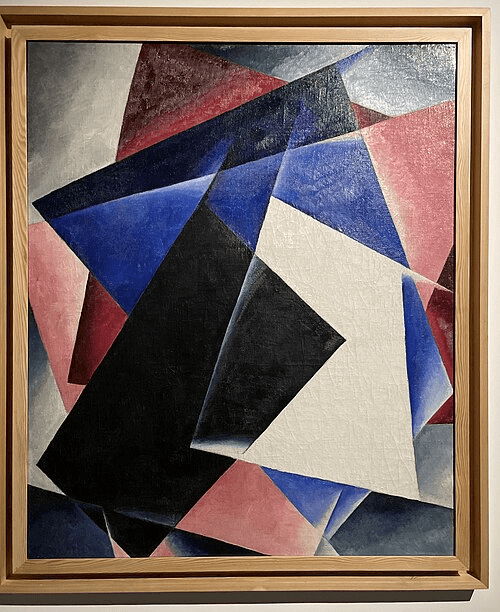
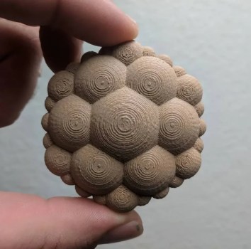
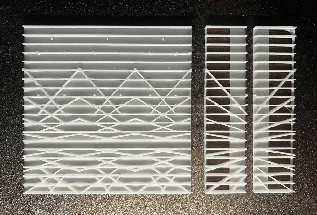
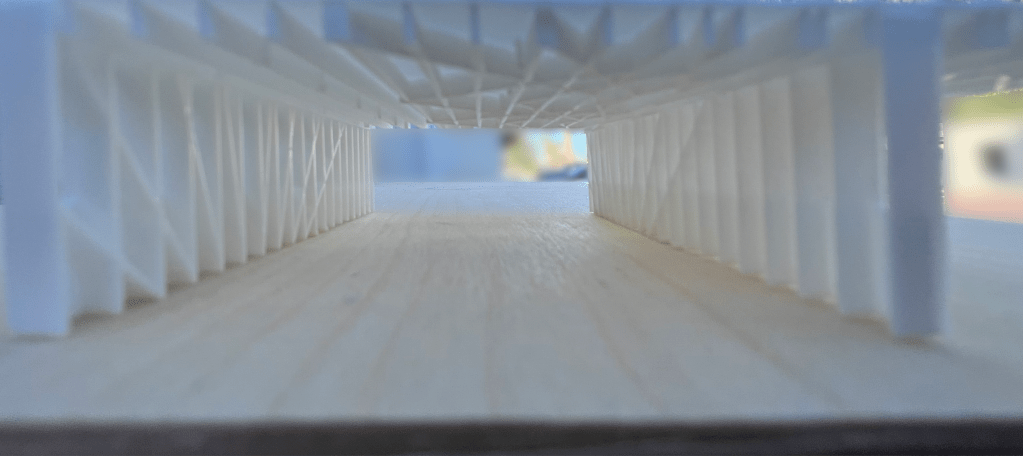
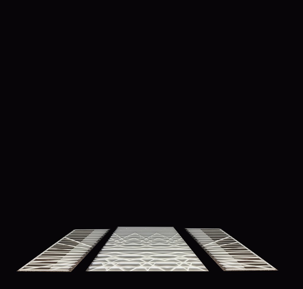
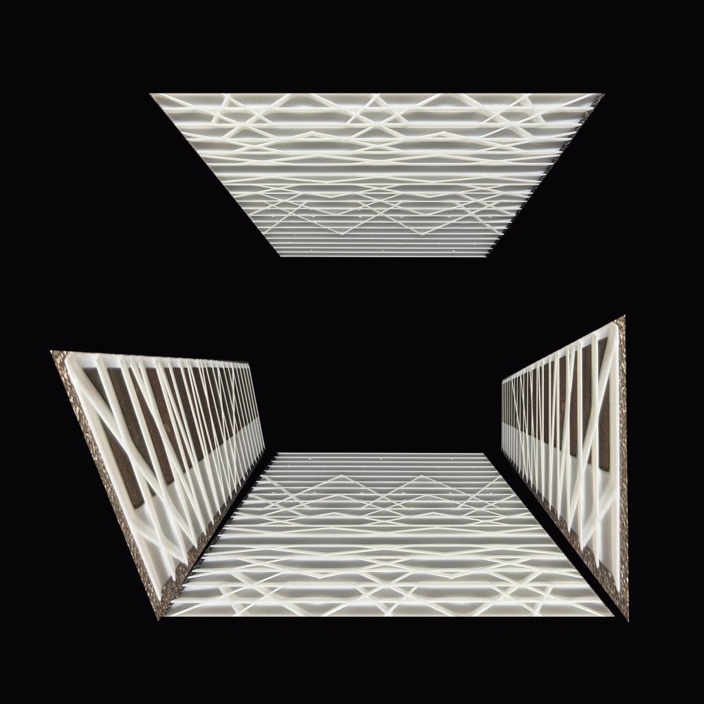
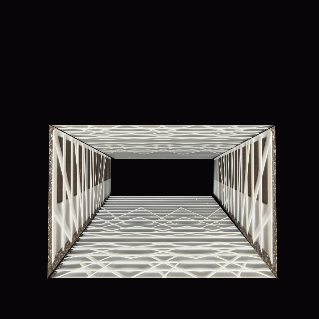
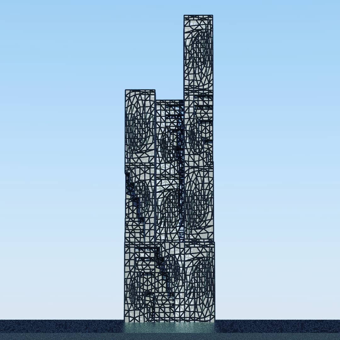
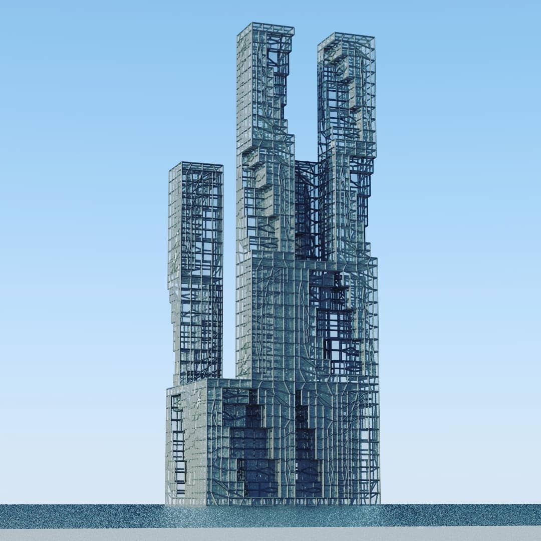
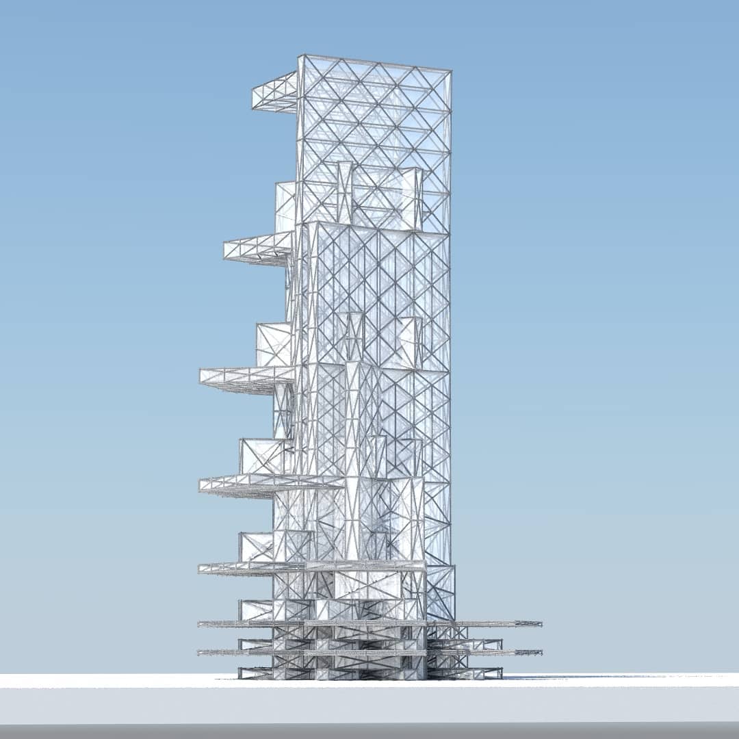
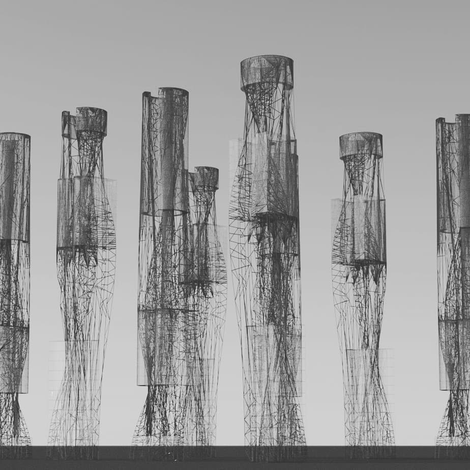
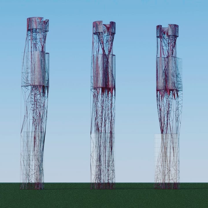
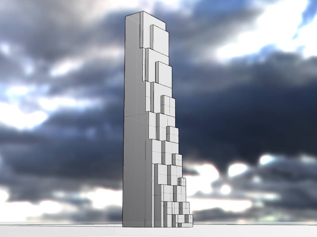
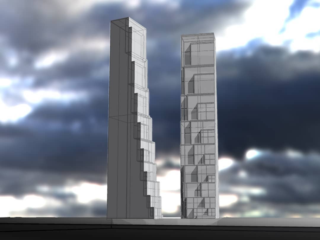
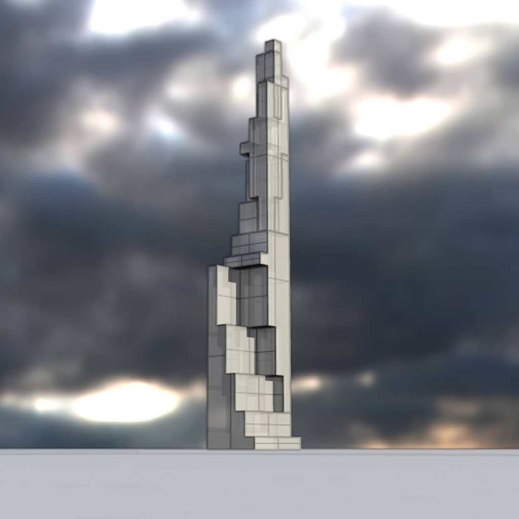
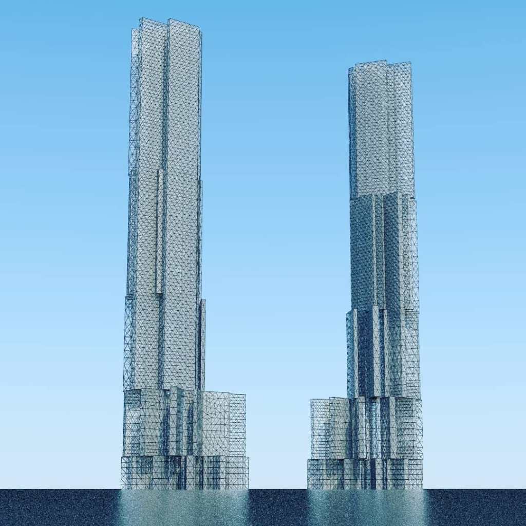
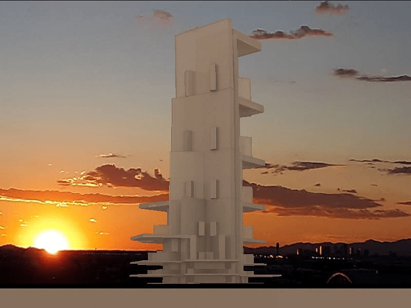
The 1910s and 1920s avantgarde developed a challenging and radical sense of architectonics. Artist visualizations from the time, might fit on a spectrum somewhere between Malevich’s “Architectons” and Popova’s “Painterly Architectonics”. Let us suppose there is some purity of geometry or trigonometry as it may be. Some mathematical functions involved to compound the forms and their barren angularity. Maybe the work is form only and no tone or the opposite, and it is a fragmentation of all colors. What might these options mean to a young philosopher such as Bakhtin, who wrote extensively about the “architectonics of seeing”? A more traditional and stable sense of Architectonics might gravitate in meaning towards order, structure, and their synonyms even while these notions were alternately evoked and banished by the architectural avantgarde.
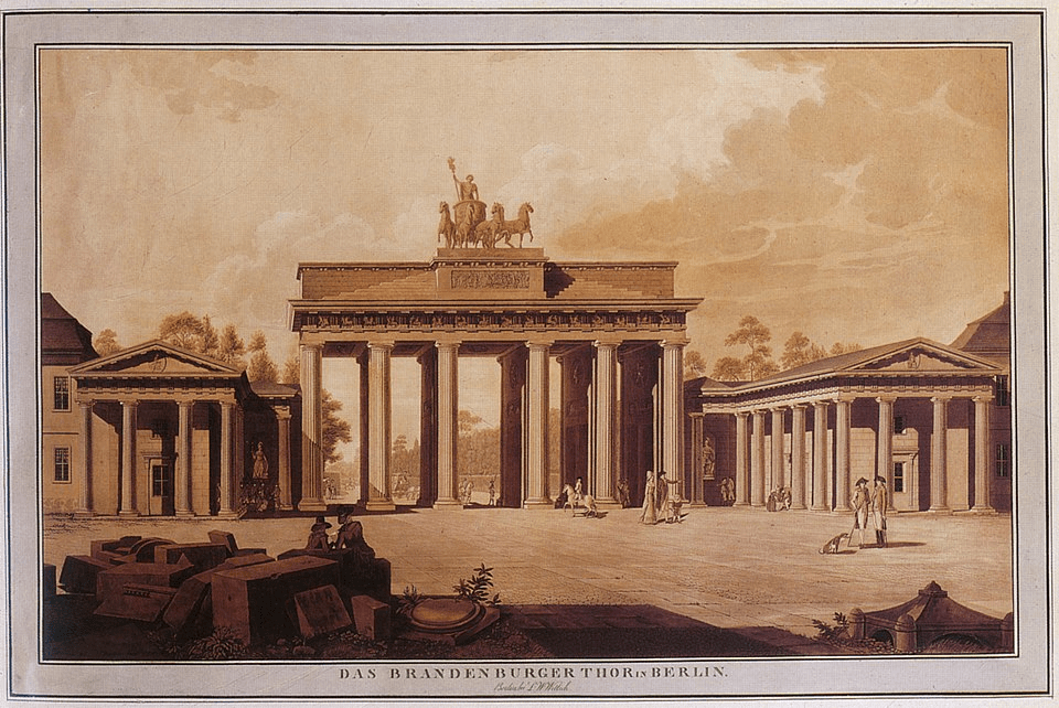
Architectonics is a rarely used word. It might mean different things to anyone asked, as architecture is so manifold. Where, when, how did architectonics enter the modern philosophical discourse? Who might have explored the topic in detail? It is certainly appealed to in the “Critiques” by Kant. In the 1780s,would architectonics have conjured in Kant’s mind some recent rococo or baroque or the turning away from those to Classicism or something else? Some archaeological idea of J.J. Winkelmann? Some kind of about to be built Brandenberg Gate? Classicism and its derivatives often lend themselves as supporting elements, imposing and reinforcing order, solidity, systemization, endurance.
[This quick essay draws on design and art to visualize what Bakhtin and Kant might be conjuring. Expect another post soon with more focus on the philosophical and philological implications, in text more solely]

.jpg)