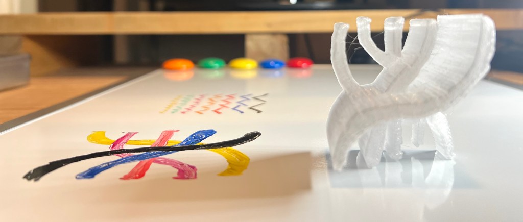
Examples from the incremental progress in the Drawing to Print method I have been improving since the last few posts.

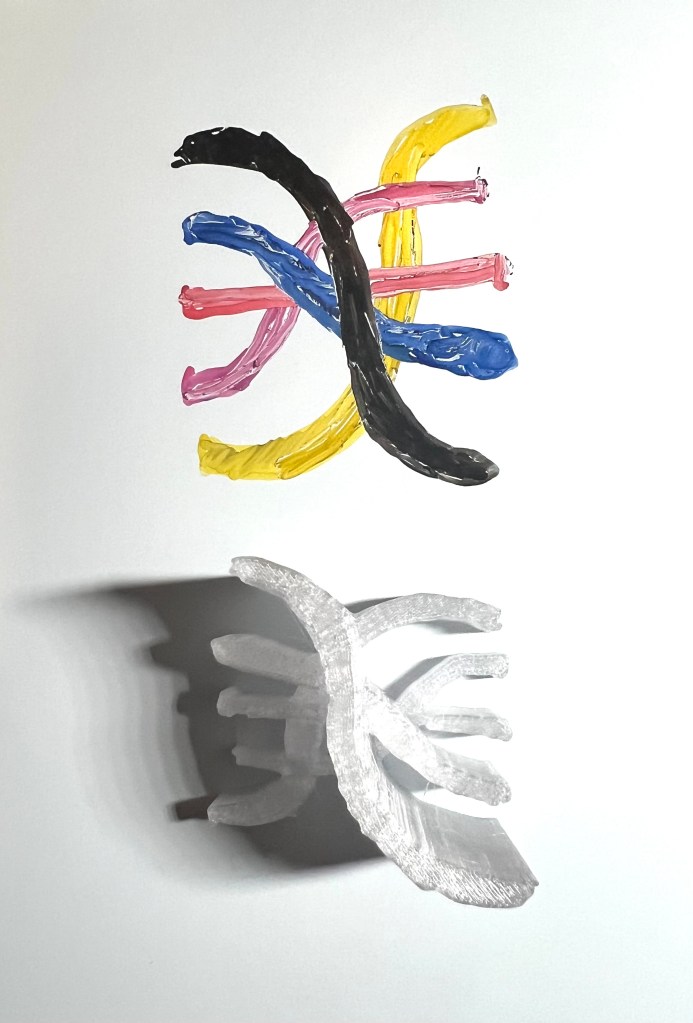
Here is the beginning and the end, the sketch and the printed result, next is the process leading up to it.
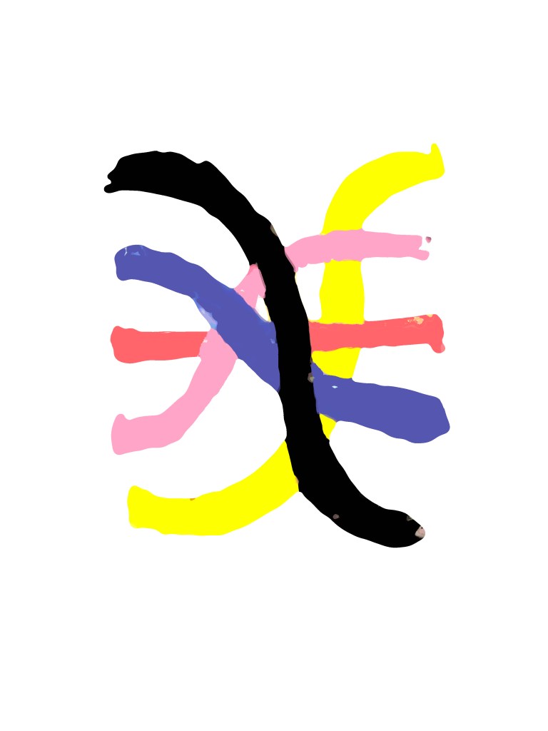
For the drawing I started with a small logo sketch on dry erase. The plan is to have multiple tones yield heights.

The next step was simplifying the drawing to its basic colors, and making it more consistent. This removed unintended spikes in the 3D software.
In the 3D software, there are some rough patches and imperfections. Especially before I realized I needed to make the tones as consistent as possible. That is the main takeaway from this test, that the process is sensitive to the inconsistencies in the drawing instruments, whether they are pencil, brush, pen. It then notices, and amplifies any inconsistency, for better or worse.


To save time and materials, the prints are in one material, translucent. It is apparent, below, how the tones of the original sketch yield height in the final print.