変な家 “Strange House” is a recent Japanese novel, manga and movie.
I saw something for it online and it caught my attention, an image with a house plan and an air of suspense and mystery. I decided quickly to review it, after reading a few more overview and publicity items.
I sent away for copies of the novel and manga from Kinokuniya, here’s the link if you would like to do so too, just search “変な家”:
I am also watching the video series on YouTube, I read that the author, Uketsu, has a strong YouTube presence:
Here is a sample with automatically generated English subtitles and overdubs:
I am about halfway done with the English edition and have watched about 45 minutes of the video. Next up I will post my “Strange House” mid-review, called: READING, OR READING INTO.
This is a quick review of the exhibition offerings at Scottsdale Museum of Contemporary Art (SMOCA), written on October 31, 2025.
I visited the museum, yesterday, on the weekly “pay as you will day” Thursday after a month or two without visiting. I was impressed to the point of deciding to write about the art on display.
What was first noticeable was a window decal by the main entry, instantly recognizable to this eternal architecture student, as the solar path diagram for Phoenix at approximately 32 degrees north. A little research will remind the reader, that a device called a “Sun Angle Calculator” featuring this diagram (without analemmas) was in production in 1951 by the Libby Owens Ford Company, and variants were used extensively in the solar design books by Olgyay in the 1950s-60s. These were further cemented in generations of architects’ training by the Graphics Standards editions printed from then through the the next 75 years. This window decal stayed with me like a compass as I viewed and was impressed by the rest of the museum’s work, and I decided to go back the next day to write.
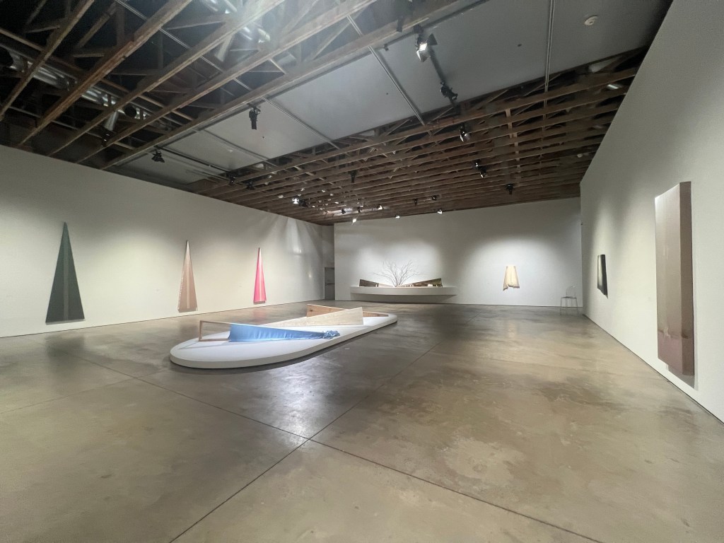
When I returned to review I took further note of Evan Roth’s work, there were more sun path inspired works but they were more evocative and artful than the basic template decal. The lobby was lined with draped fabrics with solar or celestial tracings in their stitching. The most appealing to me had traces of horizon and perspective, such as “Old Town and Littrow” of 2025. I thought at first there was some wash of colorful dye on the cotton but it is a digital print of sky coloration, I read. There a few celestial paths were traced, or perhaps the sun at several times in a year then combined.
A digital kiosk showed Roth’s experiment with a solar path smartphone app, which I have also tried and recognized as a result of these explorations. Roth designed an immersive digital film, Pathfinding, in the screening room by the lobby. The film, as usual for me, was a little harder to understand and more of a mood or vibe to sit and soak in, as an immersion.
I asked about curation and overarching themes for the exhibitions at the reception area and was told this Summer-Fall work showing until February, was curated by a few individuals, and they are listed in the fine print on the statement for each artist. Julie Ganas curated the work of Evan Roth, and I noticed Ganas also curated the work by Casey Curran, Tidal Sky, which I will address next.
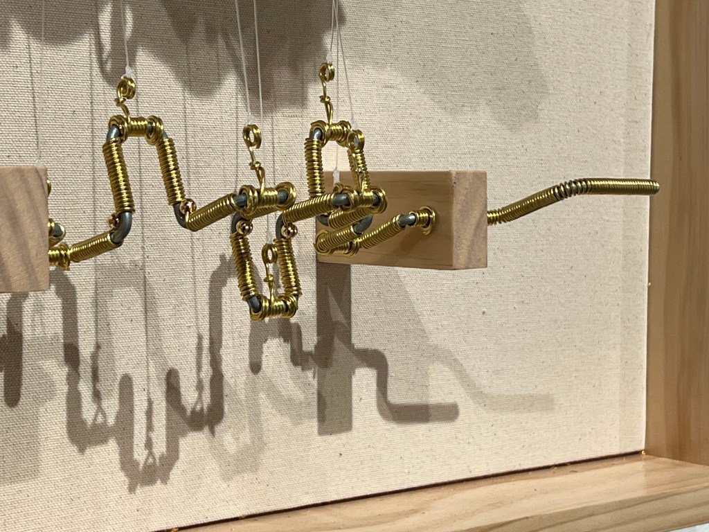
On my first visit I walked briskly through the Tidal Sky gallery and the work did not register until one of the docents suggested I twirl one of the handles on the work. (see illustration) Unfortunately, I cannot post video on this web log, would be nice to show you how the work has very subtle and charming movements.
What is nice about the work is that it is instructional to the extent that once that handle is twirled and the magic is set in motion, you can still understand exactly how it operates. My words can assist, you should see it for yourself, and learn firsthand. Most of the reliefs feature skeletal animals fancifully reinvented and animated by marionette like mechanisms. Like these gilded, flying and floating natural history specimens, the skeletons of their controls, their inner workings are revealed, as if to say, “here is how you do this” yet the fine detailing is such that one would not easily be inclined to attempt to recreate them for fear of failing to accomplish such high quality. They are music boxes in the simplicity of activation, yet without boxes so you can see how every movement is created, also without music for that matter, they are set in motion with a rotational turn of a handle, more like automata.
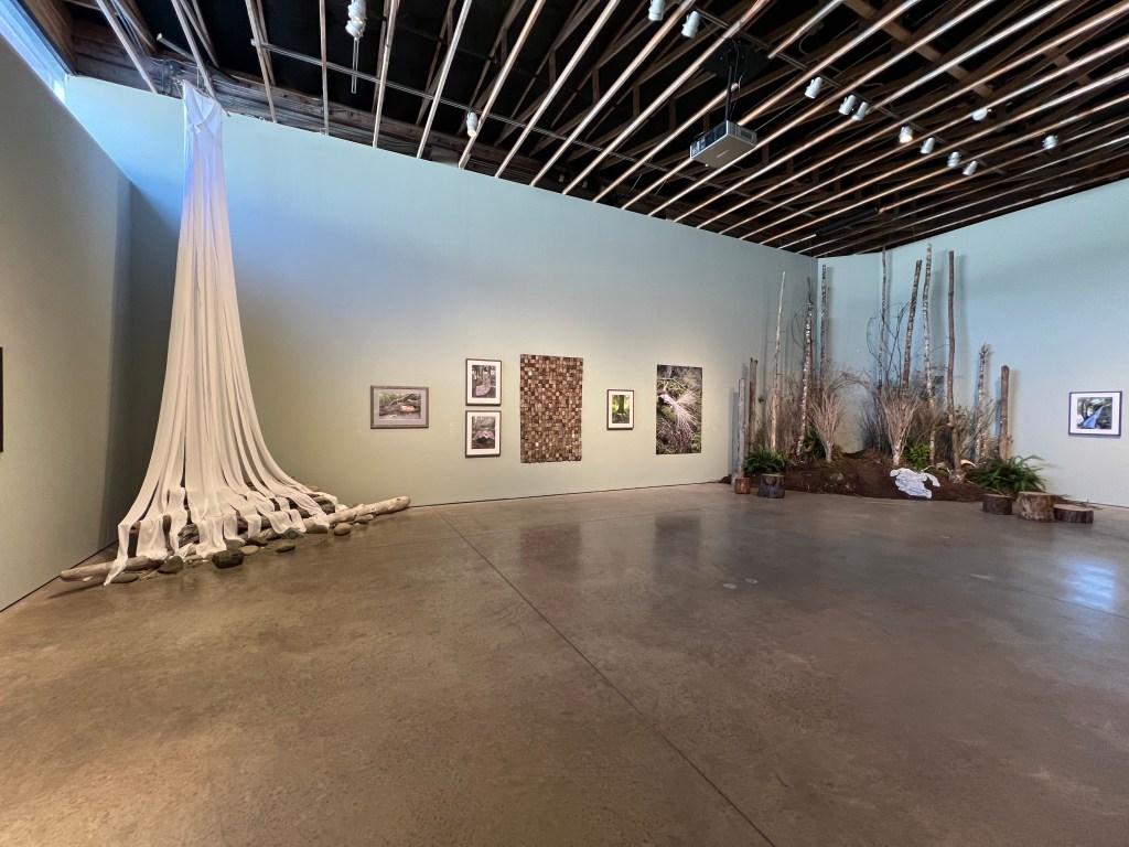
Jeanne K. Simmons’s Rooted, shows artifacts and photographs of forest and ocean settings, with a woman enshrouded in clothes made of natural materials. For instance, there are images of a woman in the woods cloaked in a cloth made of bark tiles sewn together. Or there is a woman perched above on a small cliff, in a fifteen foot long streaming cotton shirt, flowing in strands downward like water, to below. Or a woman is mermaid-seeming, swimming in the ocean in a dress made of kelp leaf strands. Or the woman is in a skirt sewn of twig branches. Some clothing items made of Nature that the woman is photographed in are present in the gallery.
James Perkins’s Burying Painting, took a minute to appreciate. The objects are in a large space with some distance between. I did not develop an understanding quickly, but after the second viewing the title sinks in and the videos helped me make sense of it. The artist used a process of digging into sites, then put stretched fabric on a frame in or on the Earth to render the image. Nature’s pigment from the ground and even coyote contribution of tearing the fabric into tatters, make these unique and grounded in our Planet. Most of the works are silks on wooden frames, with that signature luster only from silk altered by Nature and the artist’s process.
I was worried about the photosensitivity warning outside Squidsoup Infinite at my first visit, but on the second time I spent more time and I enjoyed the experience. The audio-visual orbs are spaced enough and visible enough in the darkness that I walked to the center of the room and took it in for a few minutes.
Began the day with a dry erase session, looking for ways to maximize surface, all the while, also thinking about ways of self shading, as I often do while thinking of conditions in Phoenix.
Two main findings: 1) a motif I have explored before–mitochondrial edges to maximize surface-only with those arranged internally to avoid direct light and heat gain. 2) egg-like structures with a hardened shell, and open to light, views, and outside space on the inside.
Developed the second idea little which I call “Birth of a Phoenix”– will work on drafting some iterations of the first idea sometime later.
As usual I simplified the dry erase sketch in my photo editor, for cleaner printing.
Archimedes’ Stomachion, Liubov Popova’s Paintings c.1918, and Depth Maps c.2018
Have recently been reading Lucretius, On the Nature of Things, and there is quite a lot in there to process. Works from antiquity are often overwhelming and enthralling. Replete with arcane ideas, references and things– I have missed on my journey so far and feel the need to follow up with. One such thing is Archimedes’ Stomachion, an antique masterpiece of geometrical abstraction. Remind me to compare it more formally and analytically to Popova’s Architectonics c.1918 and other triangular abstractions of the early 20th century.
In May of 2018, I was finishing a Masters of Architecture degree and was soon to join a program for a Doctorate of Philosophy in design. All indications at the time pointed to a PhD project on avantgarde and modern art, design, and architecture in the early Soviet Union. I had payed a lot of attention to Liubov Popova in my readings. Her story and imagery were impressive and intriguing, especially any “Живописная Архитекектоника” (Painterly Architectonic) — as that phase combined art and architecture with the possibilities and mysteries of trigonometric space.
That May, and for the few years after, I was testing several approaches to my doctorate. And testing a few and fulfilling other lines of inquiry. Would I work on some kind of building science? Visual analysis? Interviewing, surveying, and polling? I settled on a historical-philological path and tread as lightly as possible. One incomplete line of inquiry was a project I called “Depth Maps” that were intended to generate depth from abstract two dimensional works. I used three of Popova’s Architectonics and ran them through some software to generate as such. The basic principal is seeing in grayscale and mapping by tonal range, assign minimum to white and maximum depth to black (or vice versa) and plotting all points of gray in between.
This month, October of 2025 I appreciate and realize more than before how important of a precedent Popova’s works are and how my efforts at Depth Maps, seven years before, are an point of departure for my recent efforts at developing a Drawing to Print method that adds depth to a two dimensional drawing.
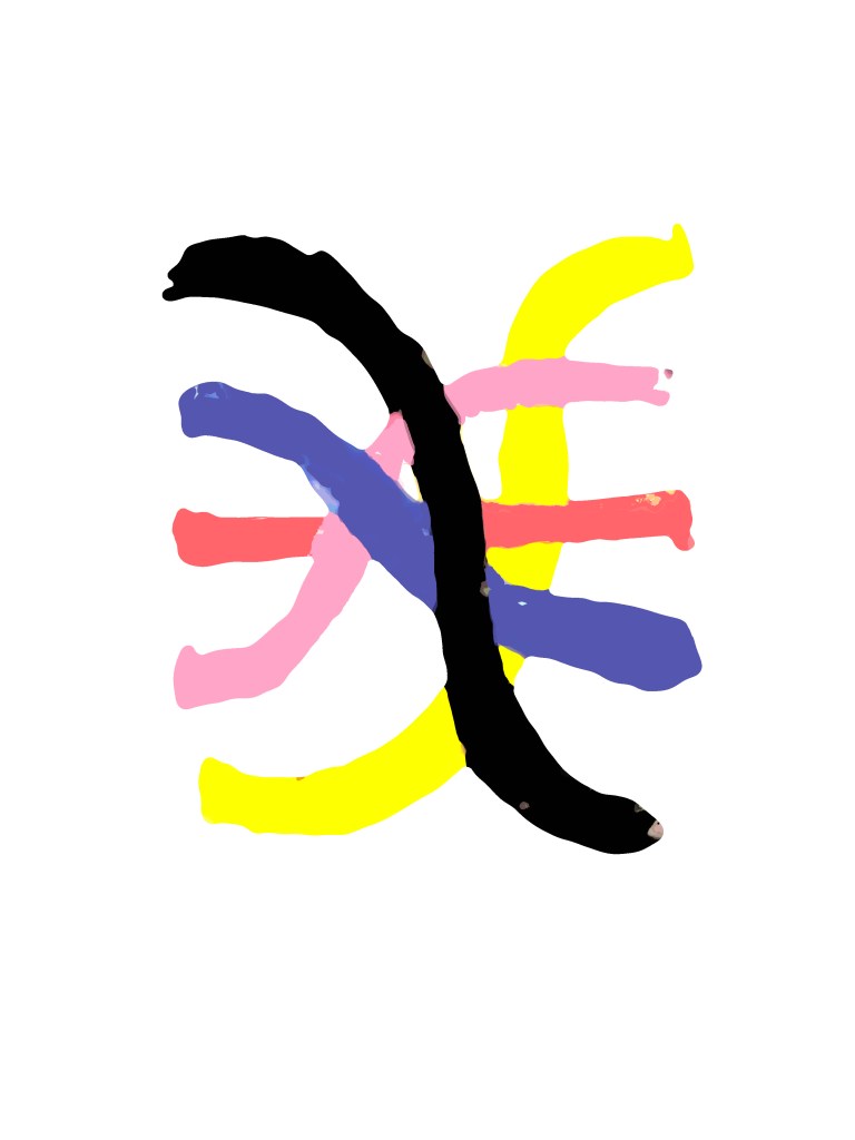
To continue the Drawing to Print method, I began with a new logo on the dry erase board, simplified the marks of the marker to one stroke and no refinishing. This logo we will call a gable array.
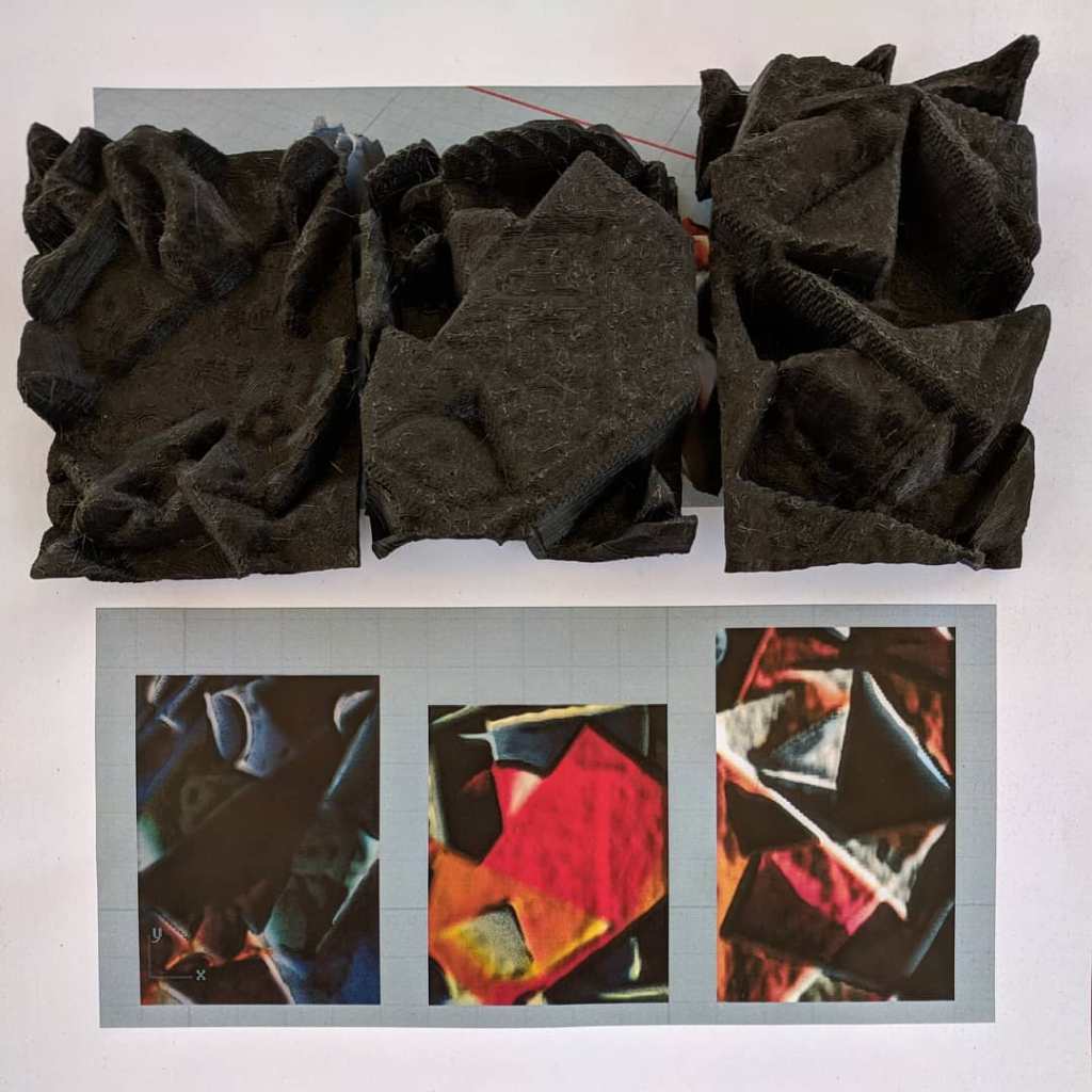
Demonstrated below are the three finishing approaches to image processing, 1) unfiltered, 2) blurred, 3) filled solid
1) unfiltered
2) blurred only
3) filled solid
We can now examine the results and qualities of each finishing approach. While slightly noticeable in the 2D editing software, they are significantly different when given 3D depth.
The unfiltered example is jagged and spiky. This is due to irregularities in the drawing instrument, the drawing surface and the lighting. In this case the dry erase marker has some high and low points that yields spikes.
The blurred only example has less jagged edges and spikes. It captures the hand drawn character very well.
The filled solid example is the most even and has the quality of an extrusion with a flattened surface at the tops of the gable array.
In conclusion, the results from the Drawing to Print method can take into account the intended finished texture, in scales of jagged to smooth, with unfiltered as the most jagged and filled solid as the smoothest. I would recommend opting out of the unfiltered and using blur smoothing at the least. When some depth of brush stroke is optimal, use the blur filter, and when flattened surface is optimal, select and fill solid.
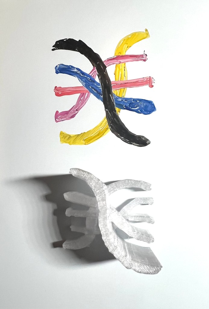
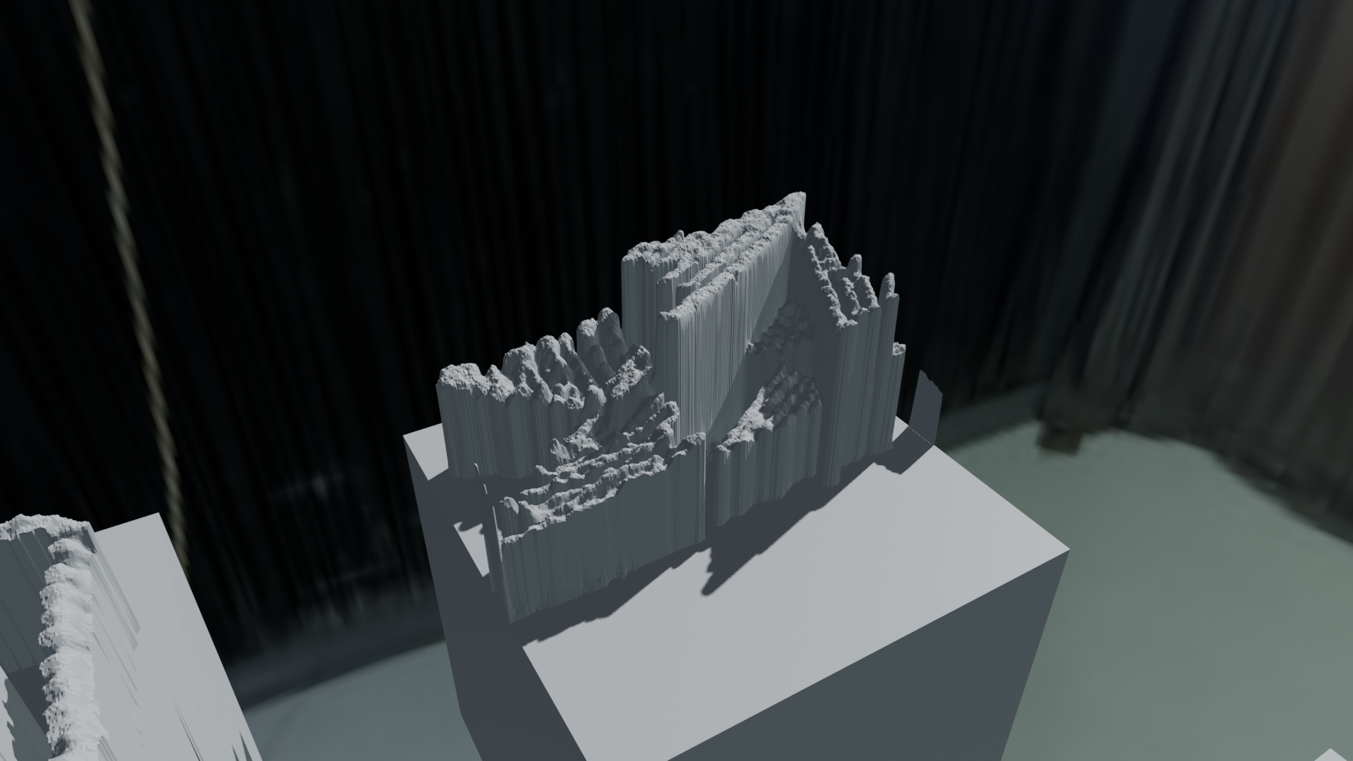
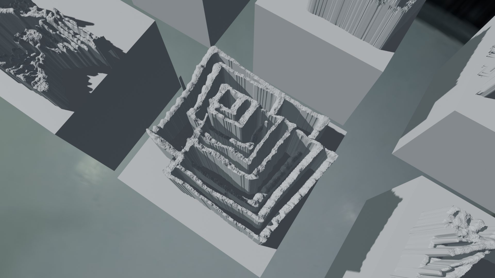
Examples from the incremental progress in the Drawing to Print method I have been improving since the last few posts.
Here is the beginning and the end, the sketch and the printed result, next is the process leading up to it.
For the drawing I started with a small logo sketch on dry erase. The plan is to have multiple tones yield heights.
The next step was simplifying the drawing to its basic colors, and making it more consistent. This removed unintended spikes in the 3D software.
In the 3D software, there are some rough patches and imperfections. Especially before I realized I needed to make the tones as consistent as possible. That is the main takeaway from this test, that the process is sensitive to the inconsistencies in the drawing instruments, whether they are pencil, brush, pen. It then notices, and amplifies any inconsistency, for better or worse.
To save time and materials, the prints are in one material, translucent. It is apparent, below, how the tones of the original sketch yield height in the final print.
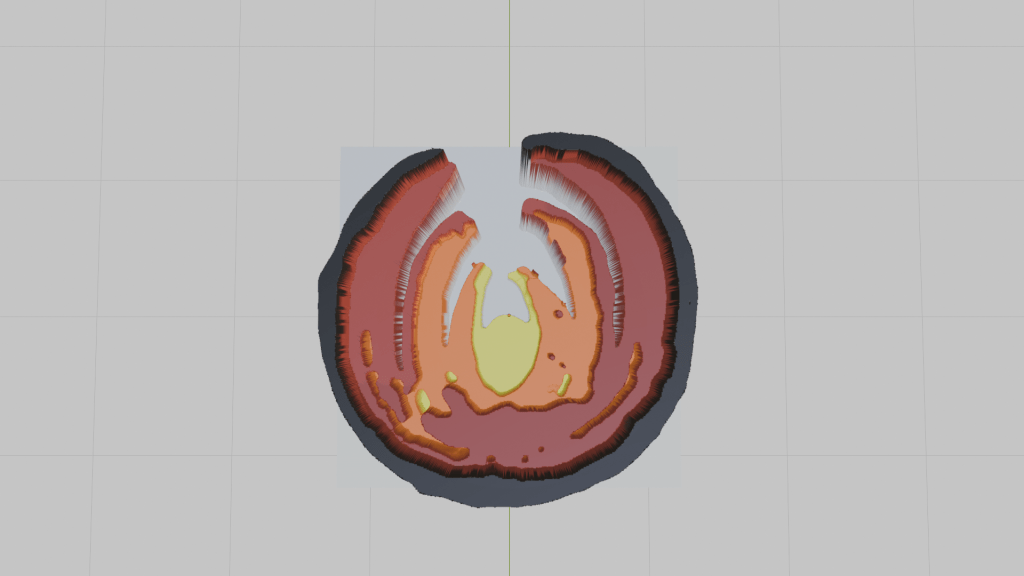
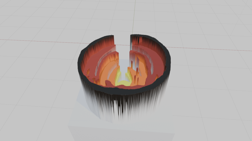
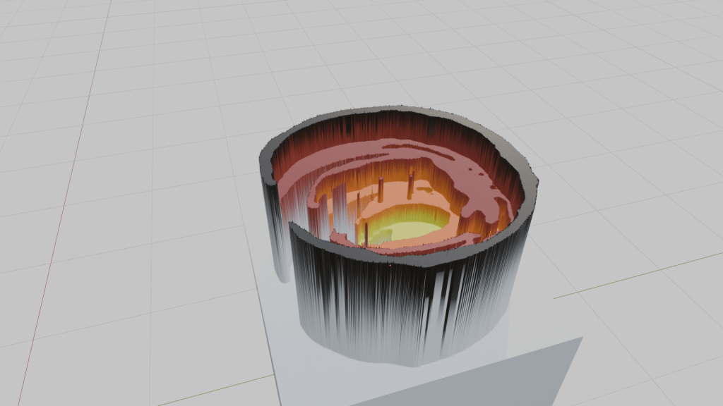
I have been working on a process for hand drawing depth maps, that will also work for hand drawn extrusions with levels using the tonal range applied in the drawing. Ultimately, these are to be digitally prepared for 3D prints. This is a status update at, I would say, midway in development. It is also at the image editing stage midpoint of the process: marker drawings -> image editing -> 3D printing.
Results of the first experiments, I made, did not go so well, I tried graphite of all sorts, brushes and inks of all sorts, but the inconsistency of the lines and tonal fields were troublesome, as was the quality of scan and the texture of the paper was more distraction and trouble. I initially thought chisel tip markers were a good option, yet had none on hand. Until now.
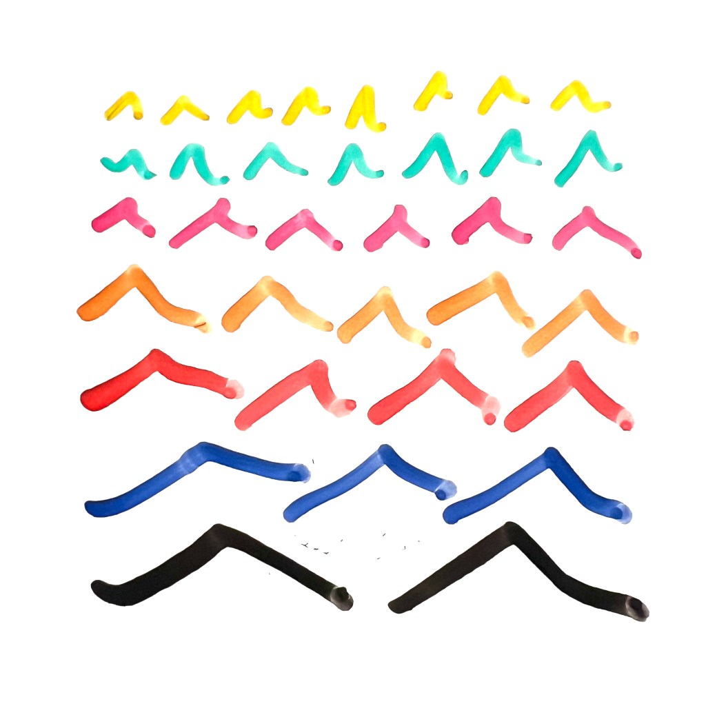
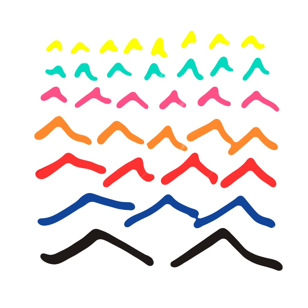
Here are the first three marker test sketches, the first is a hyperbola, second nested boxes, and the third is diagonals. I used a few shades of tone, I selected the black pen, the #9, #7, #5, #3 — the levels of tone are not as apparent as I had hoped.
1) hyperbola
2) nested boxes
3) diagonals
I realized these were extruding in a way that is too grainy still and found some image processing filters to blur them in my photo editor. This took out a lot of the points or spikes. You can see them paired, the original, completely spiky models and the more smooth models, in the images and animation below. Enjoy. These were test scribbles, which leads to the big question: what to draw next?
In the United States, we have seemingly very little language governance. We have freedom of speech. We have freedom of the press. We have no official language.. We do not have official censors, we have editors for publications. Our most common language, English, is not even our own. So when we have extensive and intensive examinations of language and codes as gate keeping factors, as a restrictive force governing over professional licensure and practice, in a field such as architecture, especially where language is not the main idea or matter, it strikes me as very very weird.
Honestly, even though it is keeping me from working and earning a living in the profession, I know and trust that is temporary, and i really have nothing against the process; I can see some benefits to this system of vetting architects and their reading skills, potentially, it just seems entirely strange when contemplated or given any thought, whatsoever.
Of course, architects need to communicate verbally, with their clients and colleagues, I am not recommending inarticulate means or have any problem with language, whatsoever. My thoughts on the product of this, the muted and inarticulate architecture that is getting widely over produced, by our verbose system, however, is another story.
My takeaways from the extensive professional vetting of reading skills required to work as an architect, amount to a lesson in scale. We need to be adept at scales of reading and processing information. While our readings may be codes and guides, here is how scales work in reading of fiction. They go from the macro scale of whole genres to individual authors to finite works to chapters to paragraphs to sentences to phrases to words to letters and their interactions. We could go further in scale to fonts and serifs, or farther still into what may be beyond that.
There is a certain scale of reading that goes well in common practice, something like how 1/4” =1’ does well in drafting. We just need to recognize that it is the short paragraph region of focus and concentrate on that, as required.
We need to read very quickly at times and very carefully at others. It may be burdensome but we have to be ready to read through 2000 page computer generated manuals or specifications when required, and at other times, at a “fine print” level, line by line, and all the while we may not (as they say) “read into it”. To be able to work and survive we need to be aware of this and pay attention throughout. The dilemma is real.
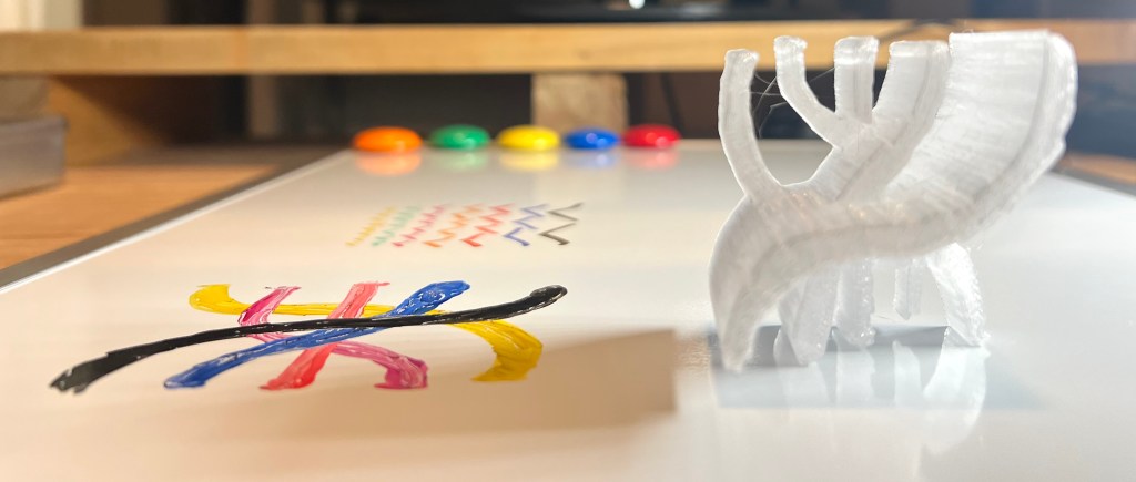
Here is a quick outline of a method for turning drawings into prints. Just a few major steps, if you have any questions about intermediate minor steps (there are quite a few) do not hesitate to ask.
Step 1: prepare your drawing.
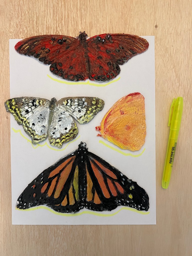
In this instance, I used some earlier prints I wanted to display with a stand. I arranged them and traced the support areas with a highlighter marker.
Step 2: digitize your drawing.
Photographs work fine or flat scanners work better for this. Bring the photo into your photo editing software.
Step 3: prepare a high contrast image of your drawing.
I did this in a free photo editor. Turned the yellow into black and the page into plain white background.
Step 3: give your drawing depth in 3D.
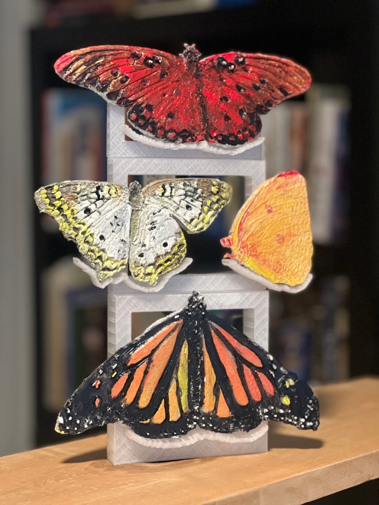
Use the high contrast drawing to extrude the object. I did this in a free 3D modelling software. This time, I needed a frame to structure the supports for the objects I wanted to display. Made that frame quickly while in the 3D model making software.
Step 4: print your drawing.
Export your files out of your 3D software and into your slicer and print as need be. I used a desktop printer.
Step 5. postprocessing
Assemble your finished product and add any finishes. Enjoy.
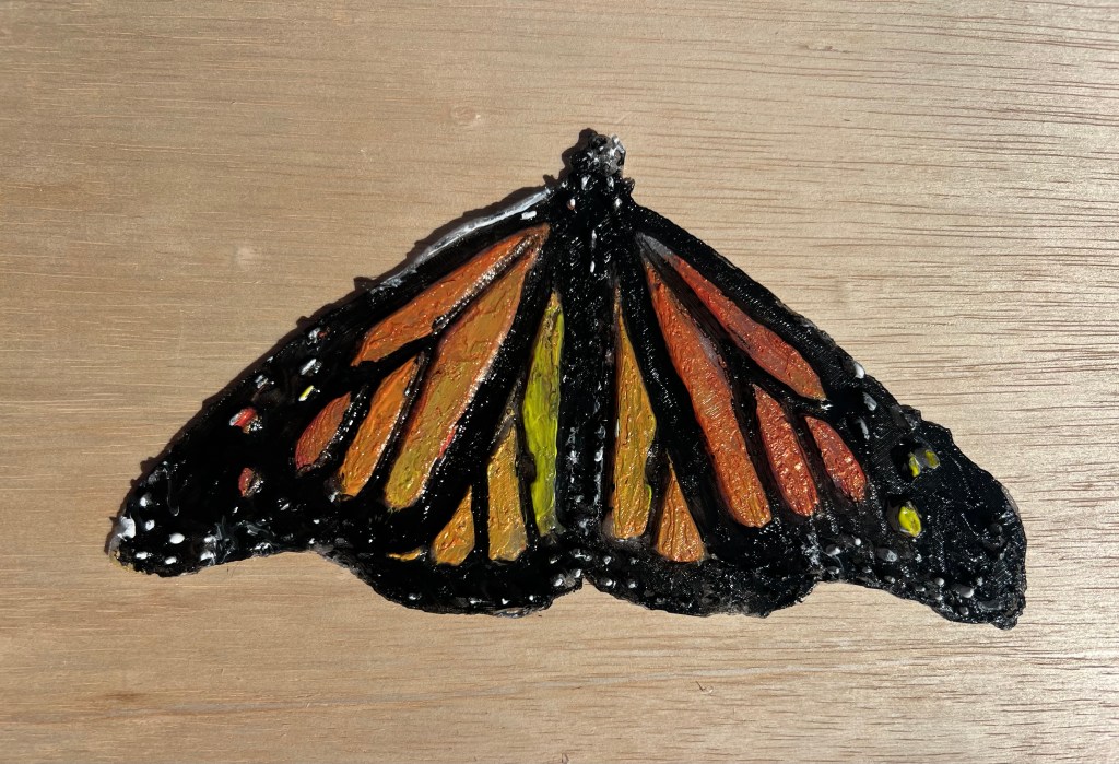
Last week, the Butterfly Pavilion at the Desert Botanical Garden opened for this years cool(er) season in Phoenix. I attended on the second day and took many photos. Since I have been on a renewed printer kick lately I processed the photos into geometry and printed them out, to finish with hand painting. I will not bore you with the process but I learned a lot about structure of color and ultra light structure of insect wing anatomy. Here are the first three: